Bad UX can kill
25 Nov 2018Users are smart people, and they all operate in a place where they don’t need to use their smarts to navigate a website. They are focused on a task and don’t even think about the way they do it causing a catastrophic event. When discussing user-experience, I’ve been in scenarios where I’ve heard folks say “a user can figure it out”, but that’s the sound of an echo-chamber.
I’m describing some examples here, each one leading to the user’s untimely demise.
John Denver
Many folks know that John Denver died in a plane crash where he was alone, but most don’t realize it was because of bad user experience design.
I’ll do my best to summarize for you the NTSB findings and excellent, well-sourced wikipedia section.
Denver’s father was a colonel in the US Air Force, and as a result, Denver had grown up around airplanes, eventually flying them, and he understood both the dangers and the possibilities. By the time he hopped into the cockpit on October 12, 1997, he’d logged over 2700 hours of flying in many types of aircraft.1
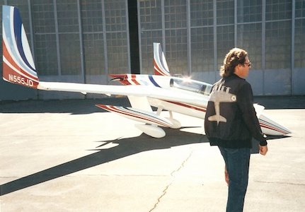
As I’ve learned, it’s not uncommon for airplanes to have multiple fuel tanks, and a pilot may need to switch the tank s/he’s using mid-flight. This is generally a straightforward maneuver. Perhaps for obvious reasons, one does not want to operate for very long without access to fuel. The plane he was flying had been built out of a kit, which is a practice that still occurs to this day. Denver did not build it himself; someone else did, but switching the tanks had been explained to Denver before he began flying. (In fact, this was his second flight in the aircraft, but the first where switching tanks became a necessity.) When he took off from the airport he had plenty of fuel, but it was clear he’d need to switch tanks during the flight.
To switch tanks in this plane, Denver had to reach over his shoulder and toggle the tanks behind him. He was given a vice to help him reach the fuel tank controls, which is pretty similar to tying wooden blocks to someone’s shoes so they can drive. He also was given a mirror he could use to look behind him. I’m not kidding about this. He had to reach over his shoulder with one hand gripping long pliers, and use a mirror with the other hand, all while keeping the plane flying. If something seemed wrong or he needed a closer look, he’d have to twist his body and look over his shoulder. A very instinctual way to do this was to swivel the body and push up with his foot. In this manner, one could end up pushing on the banking pedal and take a sharp turn to the right.
Based on 4 observers that saw the crash, the plane took a sharp bank to the right before going down. When the plane was recovered, it was found that the fuel adjustment was halfway done.
It was not only tricky to understand how to do it, but it was difficult for a user to execute. The user actually was doing the best he could under the circumstances, but ended up falling into a lethal usability trap.
Monostable shifter
The Monostable shifter was the reason for a recall in over 1.1 million Fiat Chrysler vehicles in 2016, and could be the cause of multiple deaths.
There was minimal user feedback, including letting someone know that they had successfully put a vehicle into the park position. As noted at the time by David Tracy at Jalopnik, “The mushroom-shaped unit does not slide up and down entirely the way a traditional automatic shifter does, but rather can be moved back or forward while changing gears, after which it then returns to center.” Tracy quotes the National Highway Traffic Safety Administration:
…operation of the Monostable shifter is not intuitive and provides poor tactile and visual feedback to the driver, increasing the potential for unintended gear selection.
In other words, it was hard to tell whether someone had put the car into park or not. In fact, according to Tracy, the difference between reverse and park was incredibly subtle. If a user made a mistake and opened the door without the car in park, there was no feedback to let the driver know the car wasn’t parked.
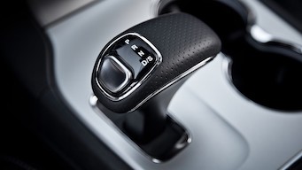
Anton Yelchin was famously killedAnton Yelchin when his Jeep Cherokee pinned him against a wall in his driveway, and many pundits believe it is because of the confusing gear shifter. By the time that had happened, there had been over 250 crashes, and nearly 70 injuries reported due to this shifter. 4
Some fixes of this issue included warning bells or even automatically parking the car when the door opened. Either way, the drivers were used to operating one way, and this particular vehicle had a different way of doing the same thing. This is a classic UX anti-pattern: a rote task that users must unlearn.
Linkstorm on healthcare usability
Sadly, there are too many examples of usability issues in health care to really pick from. I can’t decide if marking patients with an X for where they need a transplant is a usability problem or a usability enhancement. But here is a series of links.
- Medical staff was so confused by UI that they neglected to give a patient her required medicine, and she died
- Study on usability issues that impact patient health
- Patient harm resulting from health record usability issues
- Alarm fatigue is a common problem within health care and systems operation alike. Here is one attempt to solve the problem.
I could keep going, but it’s turning into LMGTFY which reflects poorly on both you and me.
Bad UX hurts, friends
Consumers and users are smart, it’s true. But we do them a disservice by assuming that they will put all their wattage on solving problems that they expect to be simple.
1: Much of this section on John Denver is taken from a well-written description on Wikipedia.
2: Photo is copyright 2018 from fototime; however, attribution beyond that is unclear. See comments here.
3: monostable shifter photo
4: “FCA bedeviled again by shifters”